Home Theater Color Schemes: Why Dark Walls Matter and Which Colors Work
Most home theater mistakes happen before a single cable is run. Owners spend months researching projectors and AVRs, then paint the room beige. The result is a $10,000 system that performs like a $3,000 one, because the room itself is working against the display.
Home theater room colors are not a cosmetic decision. Wall color directly affects the contrast ratio your display achieves in practice, the perceived sharpness of the image, and how much eye fatigue you accumulate over a two-hour film. The physics are simple, but the implications reach further than most guides acknowledge.
Why Dark Walls Are a Functional Requirement, Not an Aesthetic One
Every photon your projector fires at the screen does one of three things: it reflects off the screen toward your eyes, it scatters beyond the screen edges and strikes the surrounding wall, or it bounces off other surfaces before eventually reaching your seating position as stray light. That third category is the problem.
Projectors work by achieving contrast: the difference in brightness between the darkest and brightest elements on screen. When stray light bounces off pale walls and returns to the screen or your eyes, it fills in the shadows. The blacks lift. The dark scenes that should feel immersive instead look washed and gray. No amount of calibration corrects this, because the problem is physical, not electronic.
The same principle applies to televisions, though the effect is less dramatic. A white or cream wall behind or beside a large OLED panel creates visible reflections and can shift apparent color temperature when bright areas on screen reflect light back into the room. The room’s colors become part of the display, unintentionally.
Light Reflectance Value: The Number That Actually Matters
LRV, or Light Reflectance Value, is the metric paint manufacturers use to express how much light a color reflects back into a room. The scale runs from 0 (absorbs all light, pure black) to 100 (reflects all light, pure white). Standard white paints typically score between 80 and 90. Standard off-whites land between 70 and 80. A well-chosen home theater wall color should land between 5 and 20 for front surfaces, and no higher than 35 for secondary surfaces like side walls.
LRV matters more than the color name on the can. Two colors can both be called “dark charcoal” while differing by 15 LRV points, which translates to a meaningful difference in light return. When shopping for theater paint, look up the LRV on the manufacturer’s website or chip card before buying. This number should appear alongside the chip or in the product specifications online.
Which Surfaces Matter Most, and in What Order
Not every wall in the room has equal impact. Prioritizing by surface helps when budgets or aesthetics create tradeoffs.
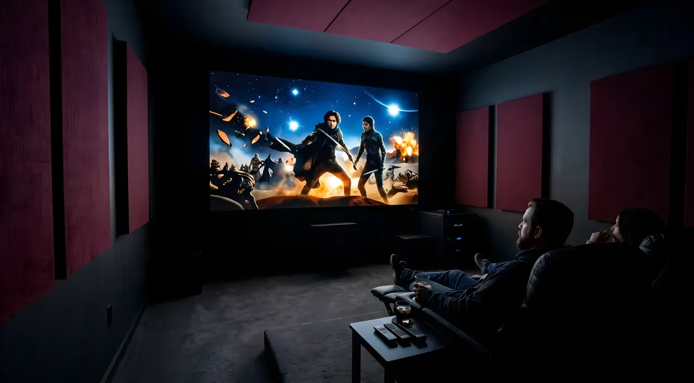
The front wall, behind and surrounding the screen, is the most important surface in the room. Light that overshoots the screen edges hits this wall first and can reflect back directly into the image. In a dedicated theater with a proper screen masking system, the front wall should be as close to LRV 0 as practical. Flat black is the correct answer here, without compromise.
The ceiling is the second priority. A white ceiling in a projector room catches light from the projector’s optical path and reflects it back into the room as a diffuse glow. This glow raises the black floor of the image uniformly across the whole screen. A dark ceiling, either painted or covered in acoustic tiles, eliminates this entirely. The visual improvement in shadow detail is immediately obvious on dark scenes.
Side walls rank third. They catch the most light during wide-angle shots with bright areas near the screen edges, and they also reflect sound, which makes their treatment relevant to both the acoustic and visual performance of the room. Dark side walls with acoustic panels are ideal. Medium-dark walls with no treatment are acceptable. Light walls with no treatment degrade both image quality and sound clarity.
The rear wall, behind the seating, has the least direct impact on image quality. It can be slightly lighter than the front and side walls, which is useful if you want the room to feel less cave-like when the lights are on. A medium-dark tone in the LRV 20 to 35 range is reasonable here.
Recommended Colors for Home Theater Walls
Dark charcoal is the most common choice and performs well in nearly every setup. It reads as a near-neutral dark gray that absorbs most of the light that strikes it while avoiding the maintenance challenges of true black. Sherwin-Williams Tricorn Black (SW 6258, LRV approximately 3) and Sherwin-Williams Caviar (SW 6990, LRV approximately 4) are both reliable options in this category.
Matte black is the right call for the front wall in any serious projector room. Benjamin Moore Wrought Iron (2124-10, LRV approximately 6) is a popular choice that skews slightly warm, which helps it feel less stark in a lived-in theater space. PPG Starless Sky (PPG1043-7, LRV approximately 4) reads true black without the blue undertone that some cooler blacks develop under projection light.
Deep navy works well in spaces where the owner wants some personality without sacrificing performance. Navy tones in the LRV 5 to 12 range absorb light effectively while giving the room a richer, less institutional feel than pure black or charcoal. The color reads as nearly black in a darkened theater and reveals its blue character only when room lights are on.
Burgundy and dark brown are less common but viable, particularly in rooms styled to feel like traditional private screening rooms. These colors absorb light well in their darkest formulations. The risk is that very saturated reds or browns can tint reflected light in ways that affect color accuracy during calibration, so confirm the chosen shade is dark enough (LRV under 15) before committing.
Paint Finish Is Not Optional: Flat or Matte Only
The finish of the paint is as important as the color. Flat and matte finishes scatter light in all directions rather than reflecting it specularly, which means light that strikes the wall is diffused rather than bounced back toward the screen or your eyes. Even satin or eggshell finishes create visible reflections in a darkened room. Under a projector, the difference between flat and eggshell on a side wall is visible to the naked eye.
There is no practical reason to use anything other than flat paint in a dedicated theater. The usual argument for eggshell or satin is cleanability, but theater walls are not kitchen walls. They are not touched, splashed, or scrubbed. Use flat paint without reservation.
Two-Tone Strategies for Rooms That Serve Multiple Purposes
A room used exclusively for theater viewing can be painted uniformly dark without hesitation. Rooms that also need to function as family rooms, home offices, or guest rooms during the day present a harder problem.
One effective approach separates the front zone from the back. The front wall and ceiling above the screen are painted flat black. The side walls use a medium-dark tone in the LRV 20 to 30 range, such as a deep slate gray or dark teal. The rear wall and upper ceiling behind the seating can be one step lighter still. This keeps the highest-impact surfaces properly dark while making the room feel less oppressive when the projector is off and room lights are on.
Dark carpet ties the whole approach together. The floor represents a large surface area that can catch spilled light from screen edges, particularly during wide shots. Dark carpet, in charcoal, navy, or near-black, absorbs this light and also contributes meaningful acoustic absorption. Hardwood flooring reflects both light and sound in ways that work against theater performance; in a dedicated theater space, carpet is the correct floor material regardless of aesthetic preference. More on flooring options for home theaters and why material choice extends beyond color.
Accent walls behind the seating row can afford to be slightly lighter, since they receive less direct projector light. A textured fabric wall covering, a dark wood paneling, or a framed wainscot in a medium-dark tone adds visual interest at the back without affecting image quality.
Velvet Wall Panels: Maximum Light and Sound Absorption
Velvet wall panels represent the most effective surface treatment available for home theaters. The pile structure of velvet scatters and traps light rather than reflecting it, achieving effective LRV values closer to zero than any paint can claim. Black velvet panels on the front wall and flanking the screen are standard in high-end private theaters for exactly this reason.
The added benefit is acoustic: velvet and other thick fabric wall coverings absorb mid and high-frequency reflections that contribute to the “liveness” of an untreated room. This improves dialogue intelligibility and reduces listener fatigue over long viewing sessions. Combining velvet panels with acoustic panels strategically placed at first-reflection points on the side walls addresses both the optical and acoustic problems simultaneously.
Installation is straightforward. Panels are mounted directly to the drywall with Z-clips or French cleats, which allows repositioning and removal. The front wall and the portions of the side walls near the screen benefit most. See also how theater aesthetics approach the balance between technical performance and visual design, since surface treatment decisions feed directly into the overall look of the room.
The Ceiling: The Easiest Win Most Rooms Leave on the Table
A white ceiling is the single worst surface choice for any room with a projector. The projector’s light cone, even when properly aimed at the screen, has enough spill to strike a white ceiling and return diffuse illumination to the entire room. The contrast ratio drops noticeably. Dark scenes become murky rather than deep.
Dark ceiling paint costs the same as any other paint and requires nothing beyond a roller and a few hours of work. Benjamin Moore Aura in Wrought Iron or any equivalent in the LRV 5 to 10 range transforms projector performance on dark content. Acoustic ceiling tiles in charcoal or black perform the same optical function while adding sound absorption, which is why they appear in most professionally built home theaters regardless of budget.
For rooms where painting the entire ceiling is not practical or desirable, treating only the ceiling area directly above and in front of the screen captures most of the benefit. The projector’s light cone is widest at this point, and darkening just this zone reduces stray ceiling reflections significantly.
Putting It Together
The order of priorities for any home theater color scheme runs front wall, ceiling, side walls, floor, rear wall. Each surface has a clear best answer: flat paint in the darkest practical tone for the front wall and ceiling, progressively allowing slightly lighter values as you move toward the rear of the room. The floor should be dark carpet; the side walls should be as dark as the room’s secondary function allows.
The specific colors chosen within these parameters matter less than the LRV values and finish. A dark navy and a dark charcoal perform nearly identically at LRV 6 to 8. Wrought Iron and Tricorn Black are both correct answers. The room does not care about the color’s name. It responds to how much light the surface returns, and that number is on the chip card.